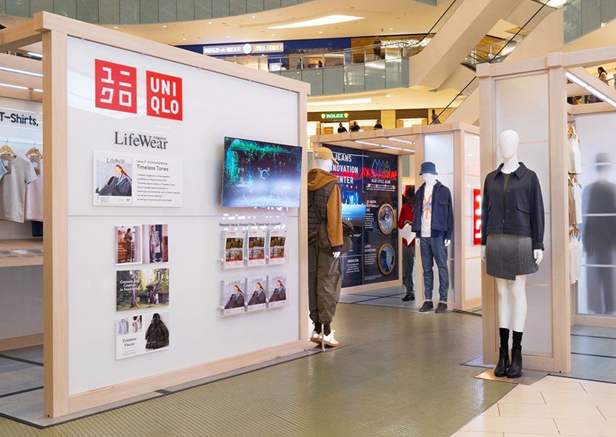
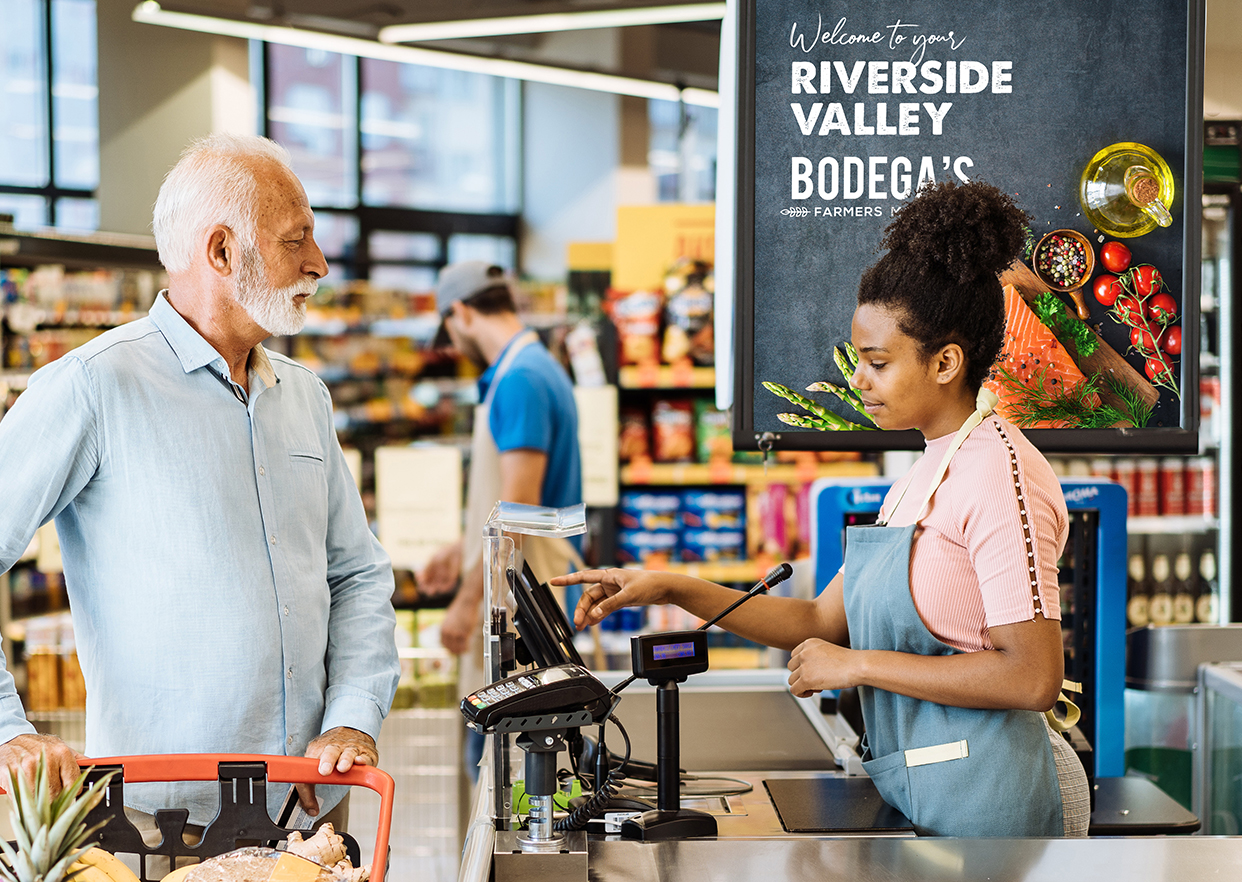
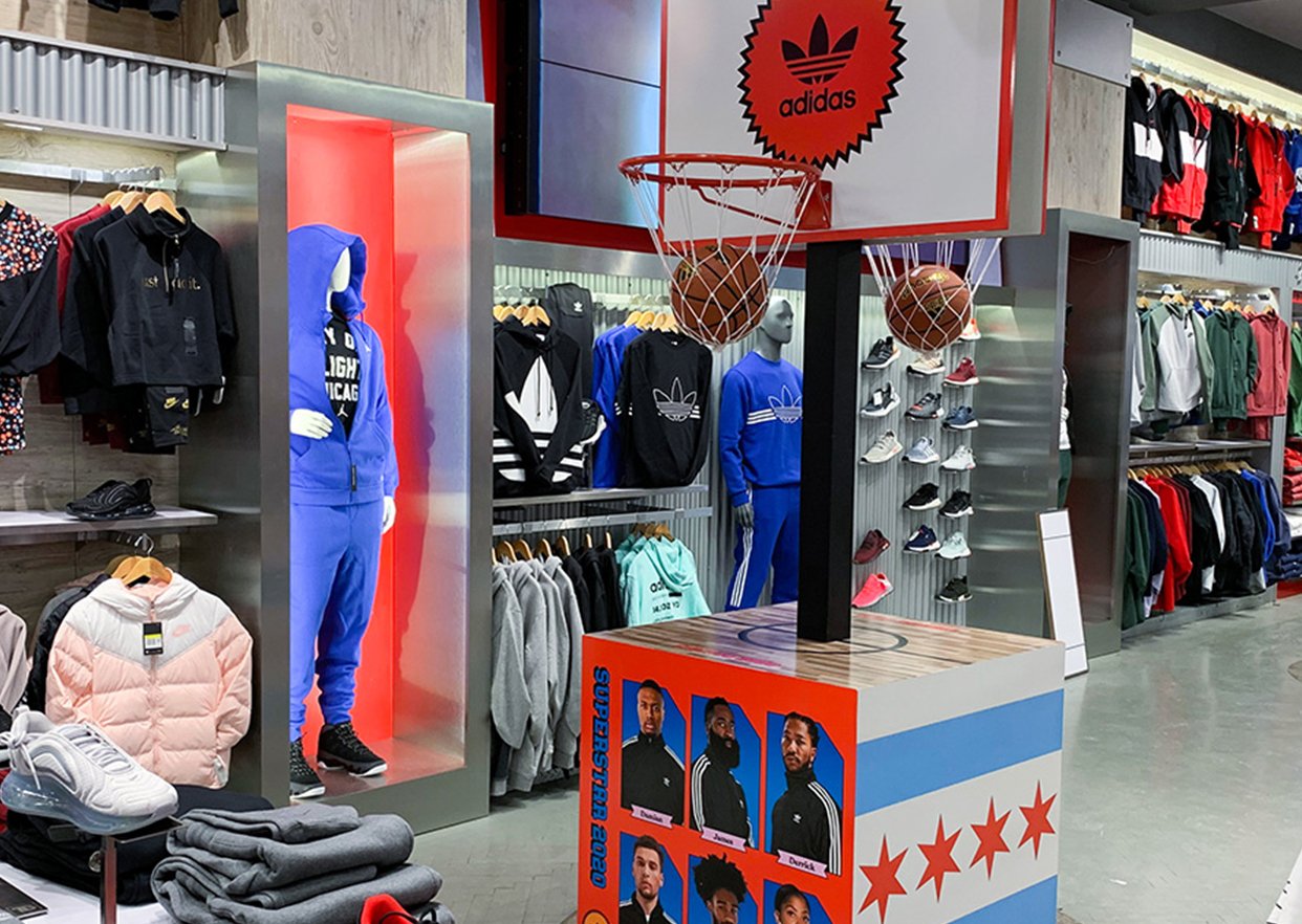
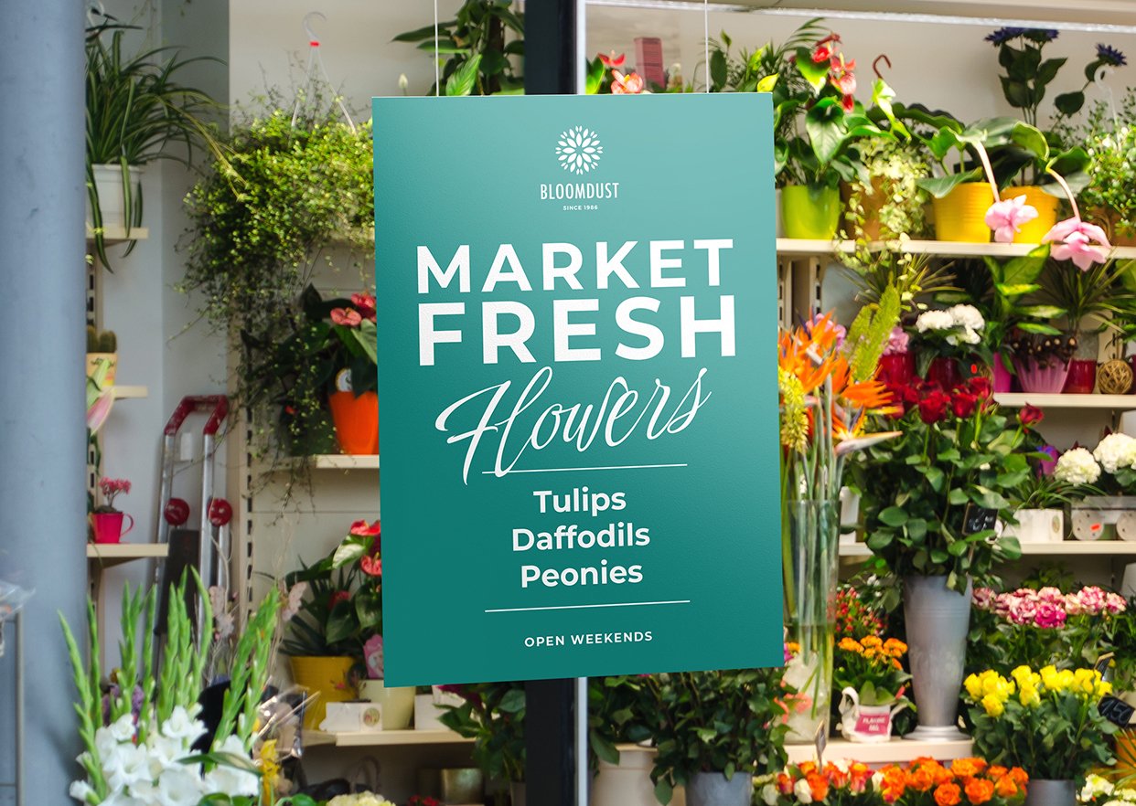
The National Retail Federation estimates that total U.S. retail sales will exceed $5.2 trillion in 2024. Contrary to popular belief, the vast majority of those dollars are still spent in physical brick-and-mortar retail stores. In fact, at last count, ecommerce still accounted for only 15.6% of total domestic retail sales.
However, the stakes are high for brick-and-mortar retailers. Much like website designers who agonize over UX design decisions, retail store designers know they only have one opportunity to create a positive shopping experience and influence purchasing behavior. According to Persuasion Nation, success or failure can happen in a matter of seconds.
- Retail shoppers make a subconscious judgment about a retailer within 90 seconds of entering a store.
- 93% of purchasing decisions are based on visual appearance.
- 52% of shoppers will not return to a store if they don’t like the aesthetics.
 Clearly, visual merchandising plays a huge role in building the authenticity of a retail brand and fostering trust in the shopper. Both of these things, in turn, are critical to driving higher retail sales. This blog will explore the five keys to effective retail store design and how to think about in-store design as a component of your retail marketing strategy.
The Guiding Principles of Retail Store Design
1 – Color
The use of color is arguably the most important consideration when creating a retail store environment. Persuasion Nation notes that up to 90% of consumers’ first impressions are based on color and that 85% of shoppers say color is the primary reason for purchasing a product.

For visual merchandising, color can be used to evoke different feelings and emotions in the shopper. Of course, the best and most effective colors will depend on the retailer and the product category being sold. Entire blogs could be devoted to color theory alone. However, the concept can be summarized as follows.
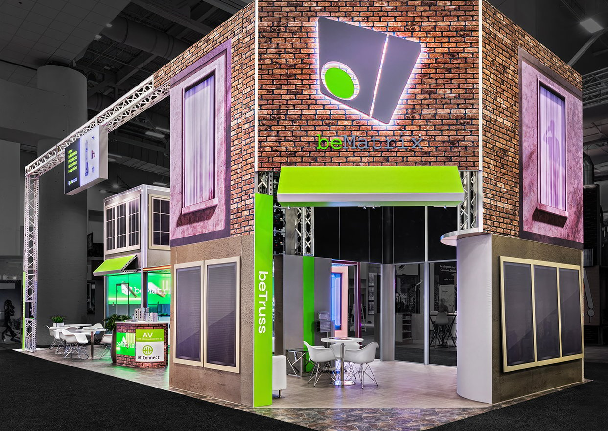
- Warm colors such as red and orange are proven to create a sense of urgency and excitement in a retail shopper. For this reason, warm colors are ideal colors for influencing impulse purchase decisions.
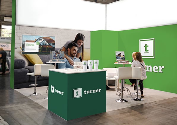
- Cool colors such as blue and green are shown to create a calming, relaxing effect in the shopper. They are also linked to feelings of trust. Both factors make cool colors ideal for encouraging shoppers to spend more time browsing.
- Neutral colors like white, gray and black are just that — neutral. Because they don’t directly influence shopper behavior, neutral colors are an excellent choice for the background in a retail display.
2 – Lighting
Lighting is another visual consideration that plays a large role in consumer behavior. Retail store designers are trained to use lighting strategically. Again, the “best” lighting depends on the retailer and type of product being sold.
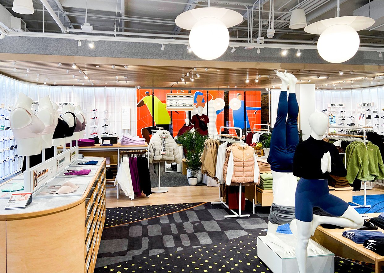
- Bright, well-distributed lighting can make a retail space feel more vibrant, inviting and exciting. It helps create feelings of energy, alertness and positivity. For these reasons, bright lighting may be appropriate when the desire is to move retail shoppers through a space quickly and encourage faster decision-making.
- Soft or subdued lighting creates a more intimate atmosphere and is shown to have a calming effect on the shopper. Often used in luxury retail settings, soft lighting creates an ambience of exclusivity and sophistication. It can also make consumers feel comfortable and encourage them to spend more time browsing.
- Combined lighting effects can also be used. For example, a jewelry retailer might use soft lighting throughout the store but focus bright light on newly released products or big-ticket luxury items.

3 – Size & Scale
Another factor that influences how retail store designers use a space is the size of the space itself. Design decisions that work perfectly for a large retail space would be impractical for a small space, and vice versa.
- Large spaces are often subdivided by retail designers into smaller “zones” of focus. Doing so creates a sense of order in the mind of the consumer and makes navigation easier. Each zone can have its own theme or style and include focal points that draw the shopper’s attention, such as with bright lighting on a certain display. The fixtures themselves should also be sized to fill the space appropriately and may be paired with oversized signs and graphics to complete the environment.
- Small spaces, on the other hand, are all about space utilization. Every square inch counts in a small retail environment. Fixtures should be smaller and easier to see around and over. They may also serve multiple purposes, such as a display table that has storage underneath for additional products. Shelving and wall-mounted displays may be used to keep the floor surface clear and uncluttered. Designers also often use mirrors in small spaces to reflect light and create the illusion of more room.
4 – Flexibility
A good retail store designer will strategically integrate color with lighting and marry them to fixtures that are appropriately sized for the available physical space. A great designer will do all of this in a way that also encourages easy, cost-effective updates and resets.
Consider the challenges faced by a big box retailer. A big box retailer can easily spend $150,000 or more — per store — on a reset that requires new display fixtures and signage systems. When multiplied by every store in the chain, the cost of a major reset suddenly becomes a major drain on the retailer’s bottom line.
The key is to develop displays, fixtures and signage systems that can be easily “reskinned” for years to come. For example, cleverly designed signage frames can enable in-store employees to swap out signs themselves, eliminating the need to hire outside signage installers. Likewise, modular fixture designs can enable a retailer to combine and reconfigure the same physical framing systems to create a variety of retail merchandising effects.

5 – Sustainability
A generation ago, this blog likely would not have mentioned sustainability as a guiding principle of retail store design. However, sustainability is now a central component of most retailers’ business models and directly influences their visual merchandising decisions.
Here again, an entire blog could be devoted to sustainable retail design strategies but the core considerations include the following.
- The use of recycled and recyclable materials in the creation of retail signs, graphics, displays and fixtures.
- The long-term adaptability and re-use of retail fixtures as a way of minimizing the consumption of raw materials (see Flexibility above).
- Strategies that minimize signage waste as stores are reset for seasonal changes, helping to keep excess signs and graphics out of dumpsters.
- Thoughtful warehousing and distribution processes that minimize the carbon footprint generated by transporting signs and graphics to each store.

Taylor: Signs, Graphics and Displays for Retailers
Taylor creates signs and graphics for retailers as well as many of the retail environments you encounter each day. Everything needed to build the authenticity of your retail brand and foster trust in your target customer is available through a single partner.
- Bolster, a Taylor company, develops innovative creative strategies while maintaining a focus on real-world execution excellence.
- Taylor’s state-of-the-art digital print technology and G7® Color Management expertise ensure that your brand comes shining through with every project.
- We are one of the first U.S. companies to embrace recycled fabrics as our standard offering for signs, graphics and display products. For rigid signs and graphics, we also offer our customers the option of using Recrylic® recycled acrylic sheeting — the world’s only line of certified recycled acrylic.
- Our campaign management software enables precise, store-by-store profiling that can reduce in-store marketing waste.
See for yourself how Taylor helps create positive retail shopping experiences that influence purchasing behavior. Contact your Taylor representative to learn more.
