Signs, graphics and displays are everywhere in a modern retail store environment for one simple reason – they work. A study by Inmar Intelligence reinforced the effectiveness of in-store signage and visual merchandising tools:
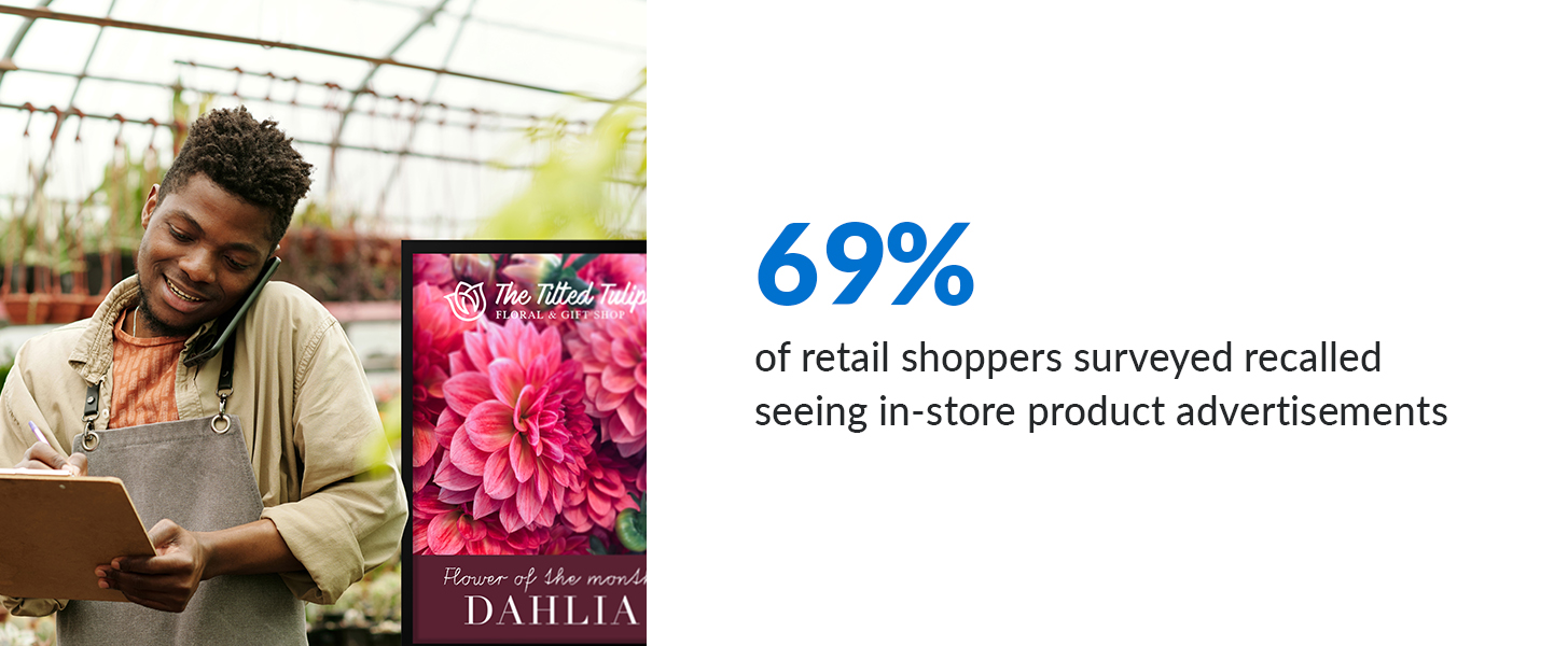
- 69% of retail shoppers surveyed recalled seeing in-store product advertisements.
- Of those who recalled seeing the signage, 69% sought out the featured product.
- Of those who sought out the product, 61% ended up buying it.
When done right, retail signage is proven to influence consumer behavior and increase sales. However, what makes for an effective retail sign? This blog will explore the various purposes of in-store signage and the five things to consider when designing and installing your signage.
The 3 Primary Types of In-Store Signage
Not all signs serve the same purpose. The first step in creating an effective in-store signage system is to clearly define the purpose of each sign. Generally speaking, they fall into three categories:
Wayfinding Signage
Also known as directional signage, wayfinding signage is intended to control foot traffic and guide the consumer through the physical space. The goal is to remove the “friction” from the in-store customer experience and make it more likely that the shopper will want to explore.

Promotional Signage
Promotional signage is intended to communicate relevant information about a specific product or service with the goal of driving purchase behavior. For example:
- A sale price (40% off!)
- A key feature (100% cotton)
- A unique attribute (Machine washable)
 Brand-Building Signage
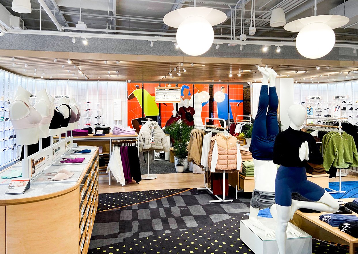
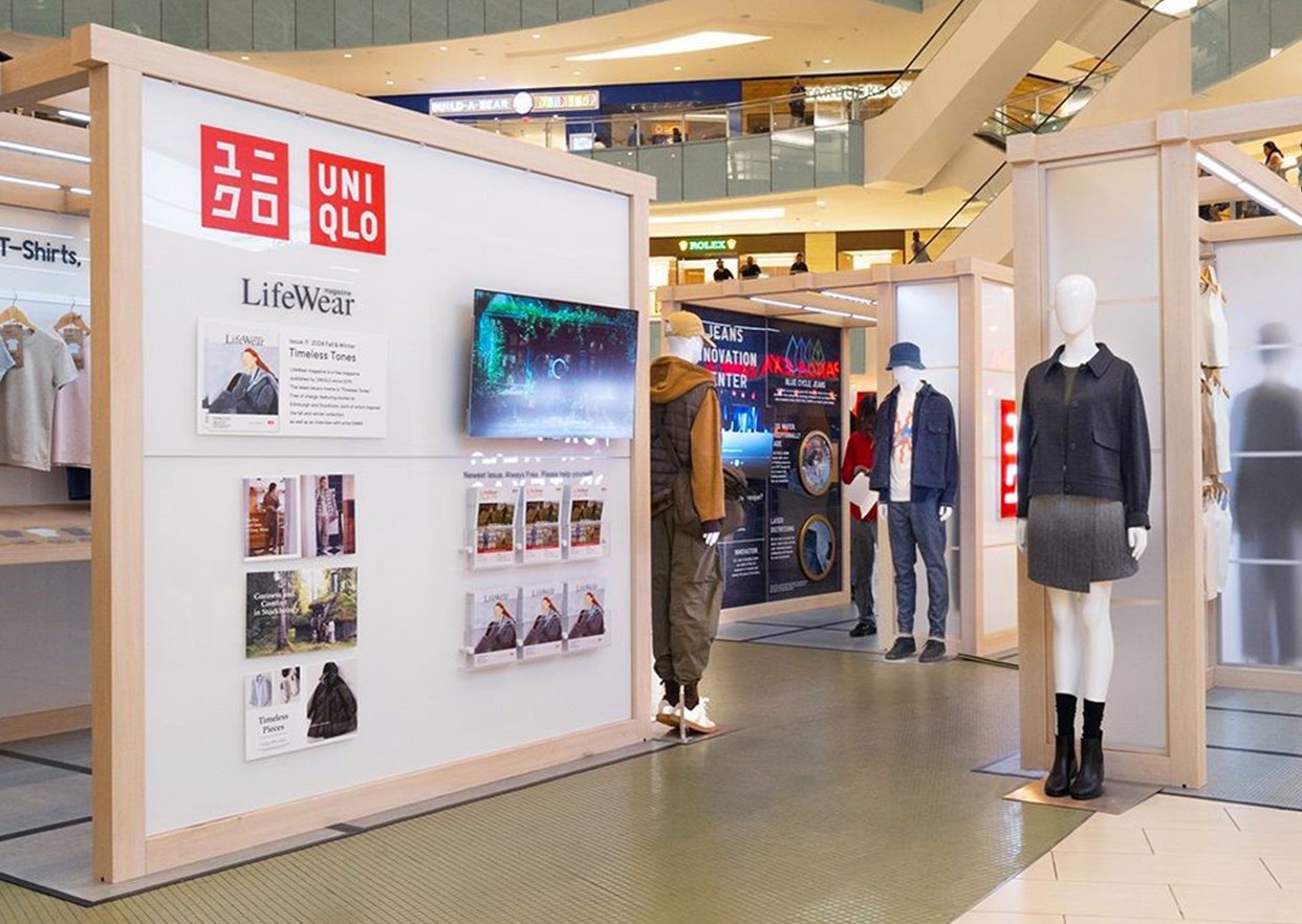
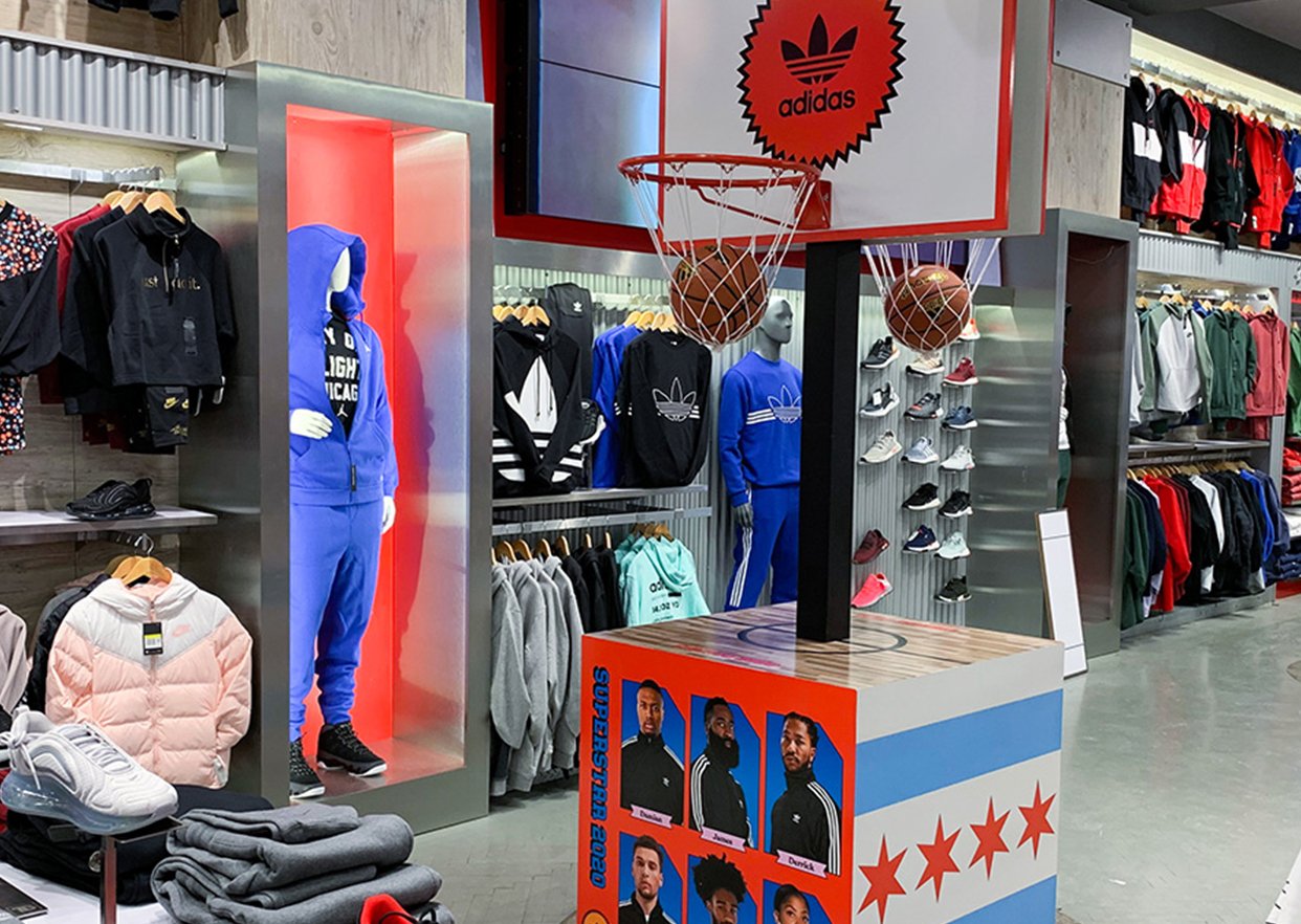
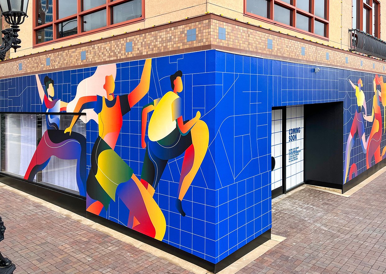
Not all signage is intended to guide foot traffic or drive purchase behavior directly. Some signage and displays are there purely to reinforce a brand, create a mood or enhance the environment through a targeted visual merchandising strategy. Such brand-building signage might even provide a demonstration of the product or invite the shopper to touch and experience.
The 5 Rules of Effective Retail Signage
With these three use cases in mind, there are five basic rules to remember when creating in-store retail signage. Focus on these five elements and you will be better positioned to unlock the results noted by Inmar Intelligence:
- Build the Brand
Colors, fonts, taglines and design themes should always complement brand positioning and adhere to brand guidelines. Signage that sends a conflicting message can damage your brand.
- Ensure It’s Readable
Readability at a glance should be a high priority. The font selected, the size of the typeface and the degree of contrast between text and background colors all directly influence readability. The harder your message is to read for passersby, the less effective it will be.
- Keep It Brief
Brevity is a subset of readability. Always use words sparingly in your signs and graphics, taking care to eliminate all padding and fluff. A single, short message with a clear call to action is ideal. The smaller the sign – or the greater the physical distance from the reader – the lower the word count should be.
- State the Benefit
Always craft your message from the customer’s point of view and lead with that information in the plainest language possible. What’s in it for them? How will this product make life better? How will purchasing the product – or purchasing it now instead of waiting – be of benefit to them? Don’t ever leave the customer wondering why they should take action at the point of sale.
- Make It Fun, Memorable or Personal
The most effective signage does more than just pass information along. Take every opportunity to connect with the customer through humor, clever phrasing or by communicating on a personal level. In addition to bold colors and eye-catching graphics, copy elements like jokes, puns and words such as “you” and “your” all help to ensure that a sign will not simply blend into the background.
Maximizing the Impact of In-Store Signage
Taylor is a leading provider of signs and graphics for retail environments as well as custom visual impressions for trade shows, events, corporate offices and more. Everything from design and prototyping services to materials science expertise, production and installation is available through a single partner.
One thing that sets Taylor apart is our use of in-store campaign management software that makes spreadsheets and email chains obsolete. They are replaced by a state-of-the-art digital platform that enables precise, store-by-store profiling, online approvals of artwork and real-time communication between in-store and the corporate marketing teams.
Our solution ensures that the exact size, style, version and quantity of materials needed is distributed to every retail location, dramatically reducing marketing waste. Your stores receive everything they need and nothing they don’t.
See for yourself how Taylor revolutionizes visual merchandising in the retail industry and helps drive retail sales. Contact your Taylor representative to learn more.
