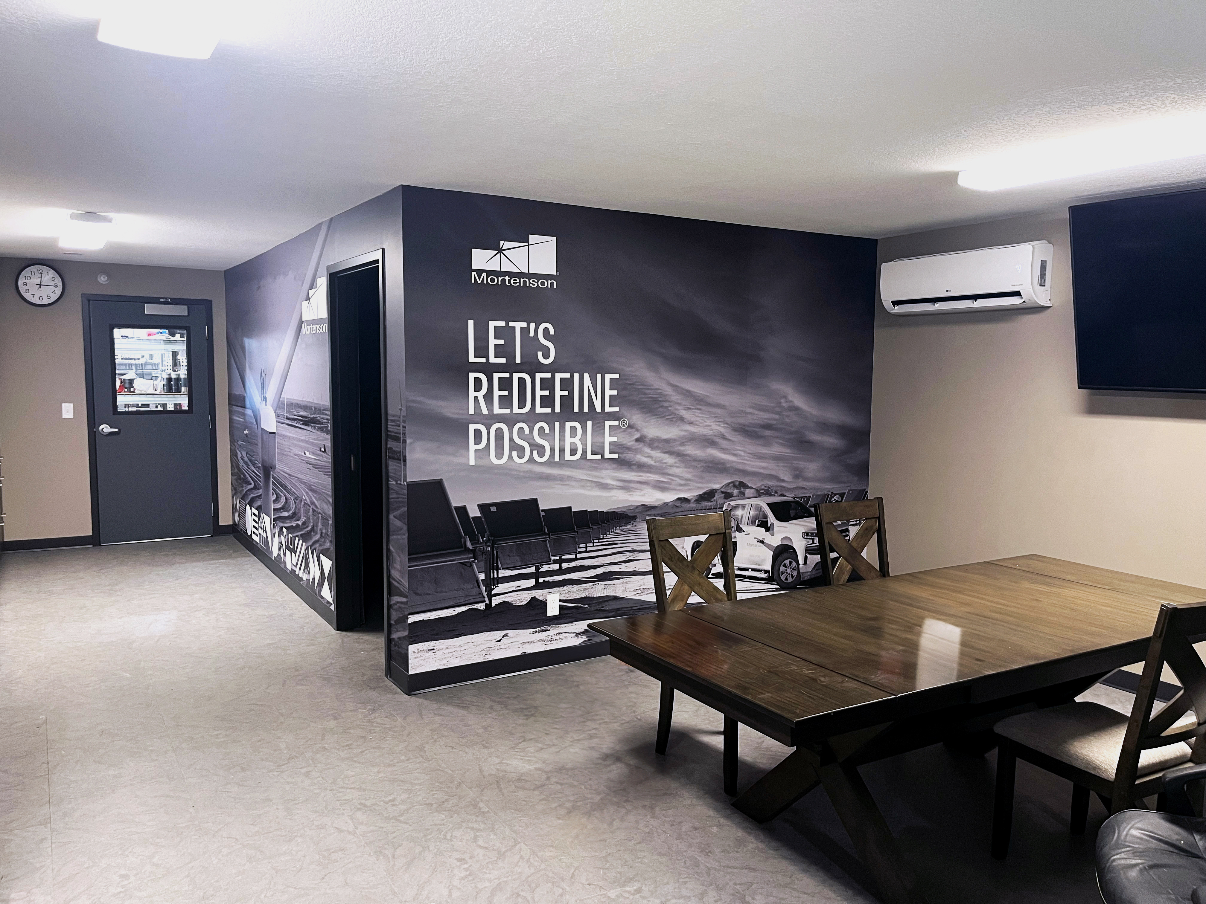
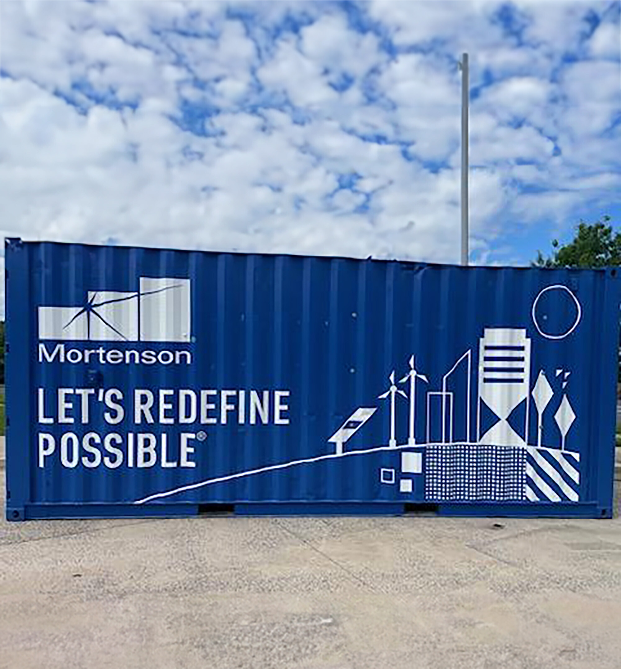
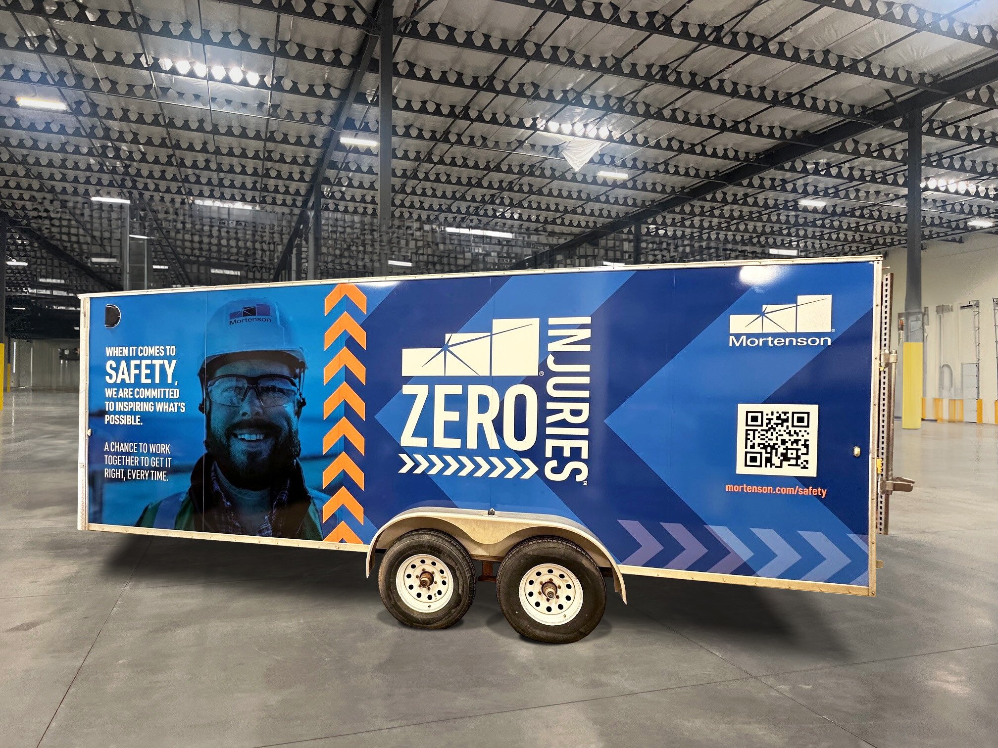
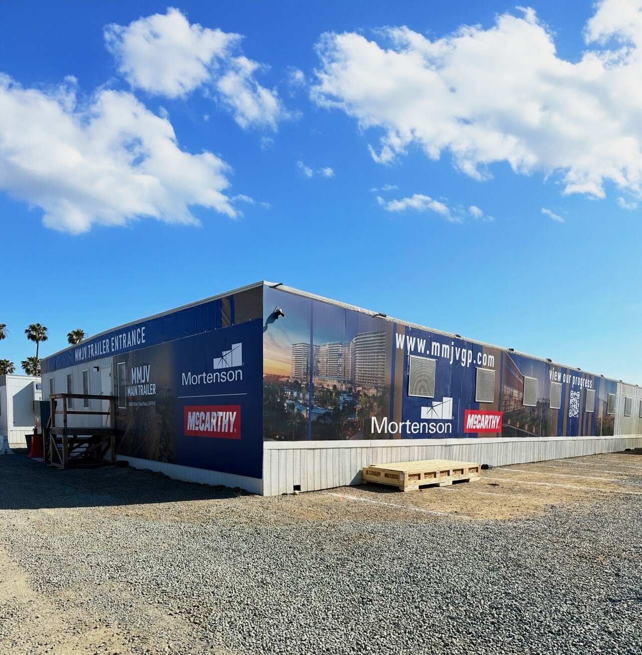
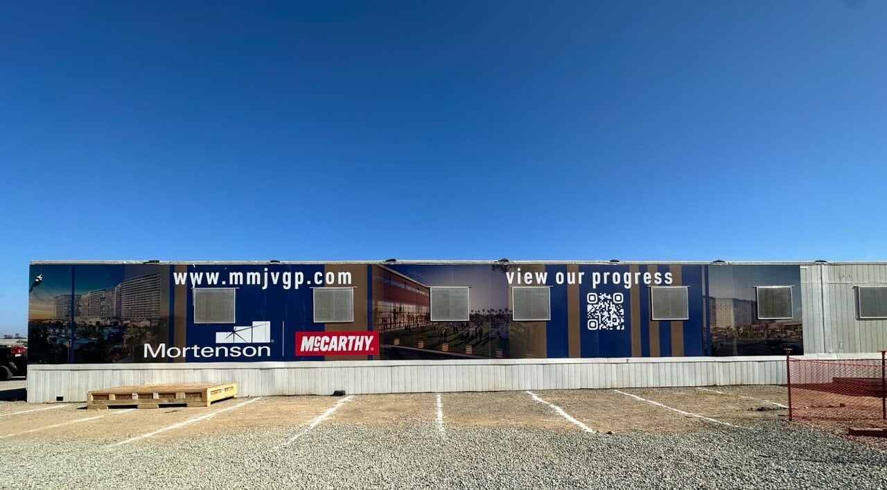
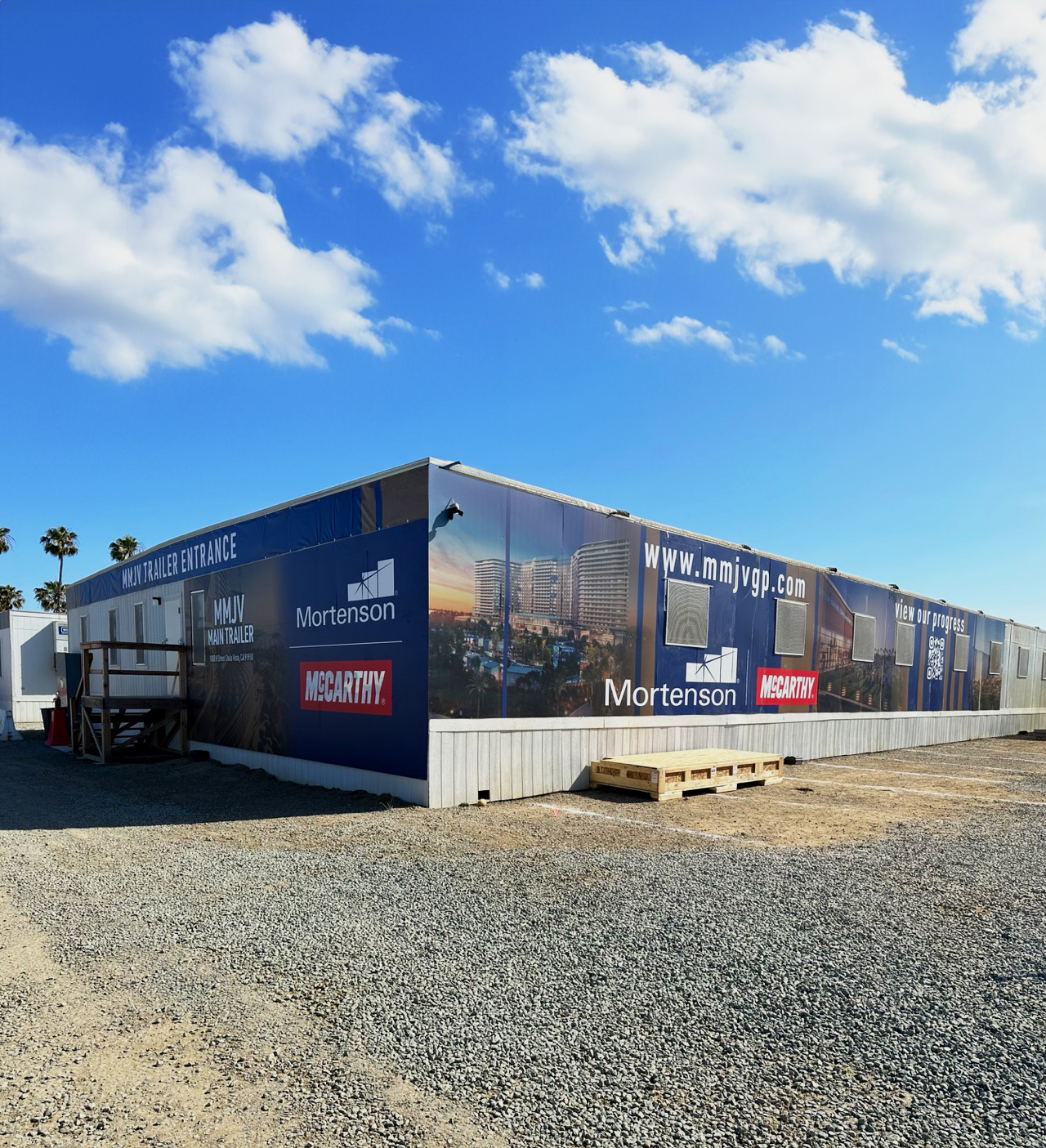
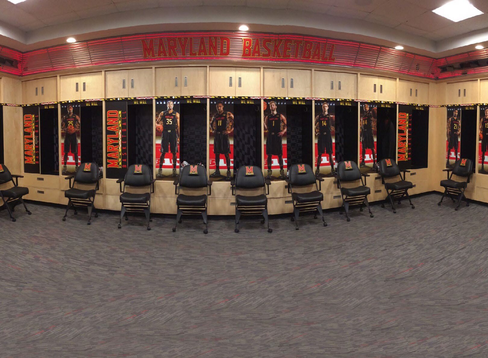
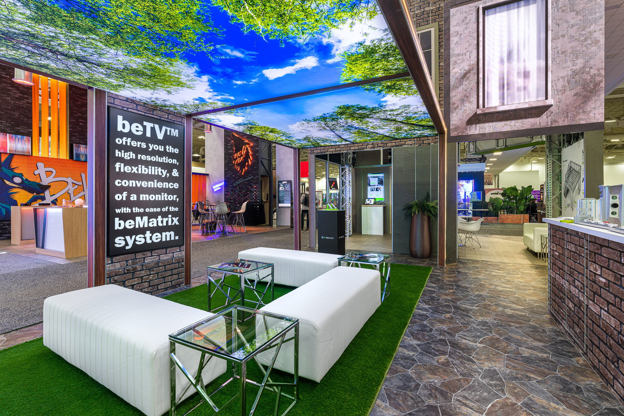
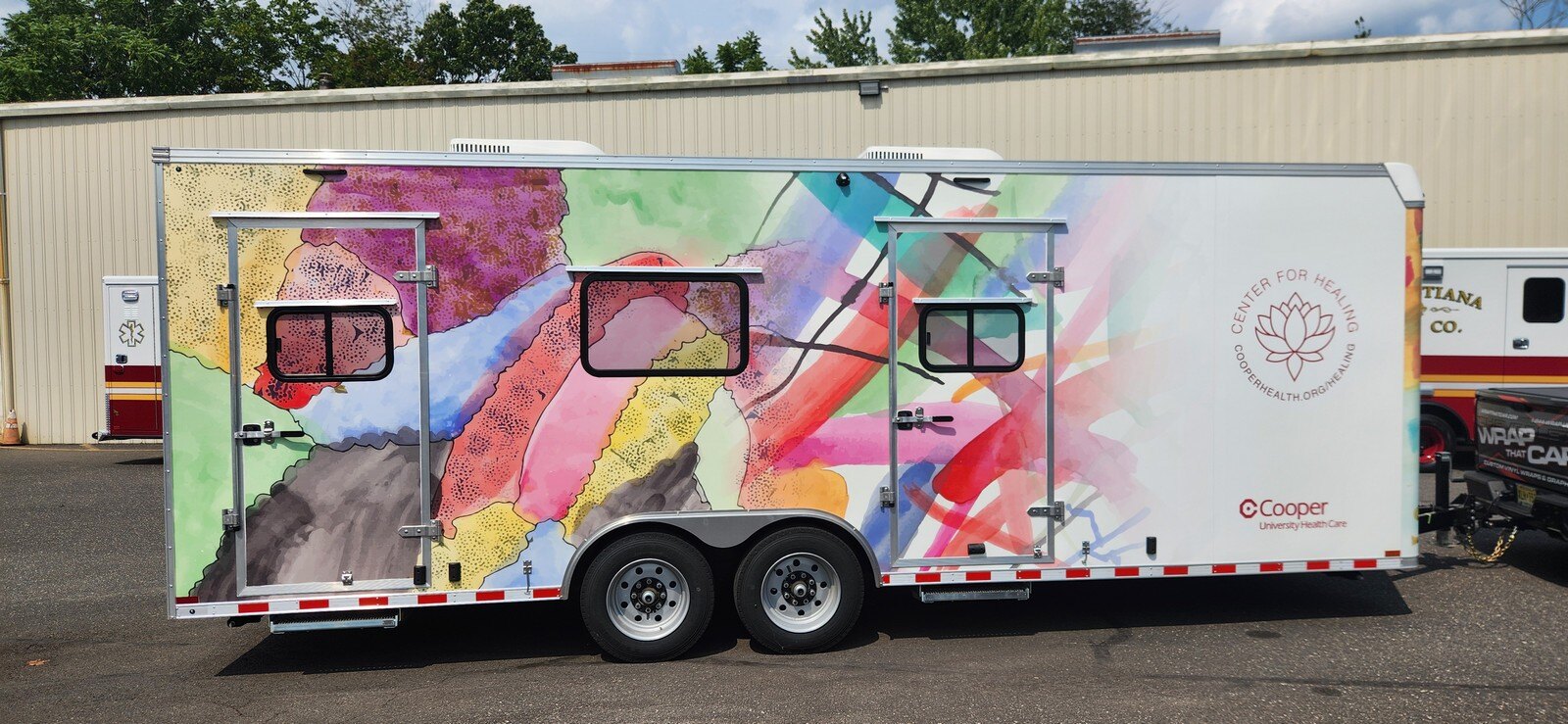
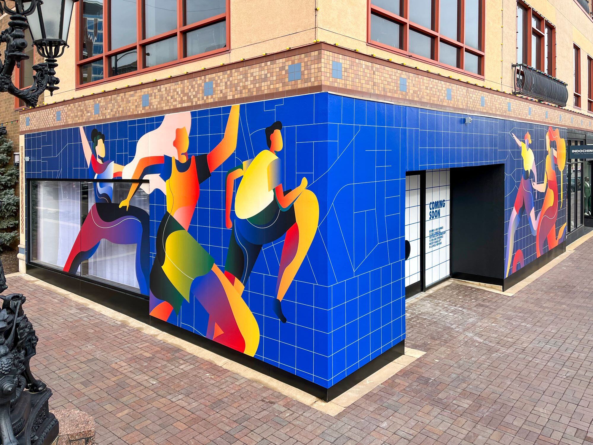
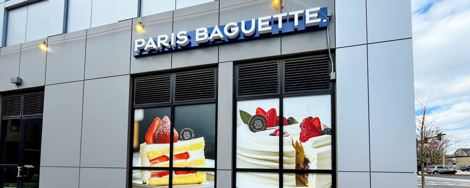
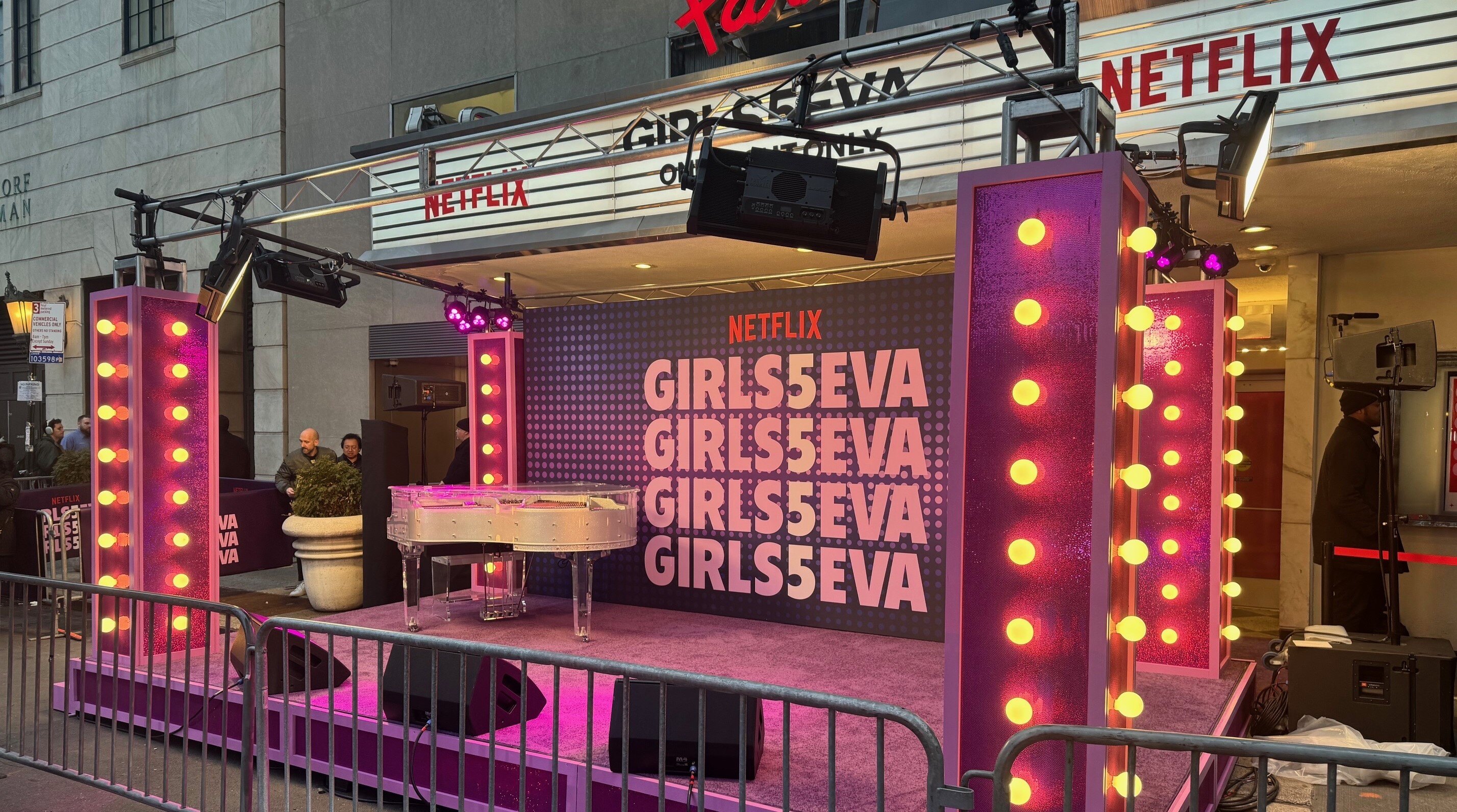
Renowned builder and developer, M. A. Mortenson, wanted to leverage each construction site as an opportunity to shine a spotlight on its brand. Taylor’s expertise with large-format signs and graphics helped strengthen Mortenson’s corporate image among all who passed by.
Everything from construction barriers and scaffolding banners to trailer wraps and shipping container decals carried Mortenson’s signature brand elements. Each item was produced with Taylor’s unwavering focus on quality and color consistency
We don’t feel like we need to communicate quality expectations. It’s just a standard on your end, which is amazing.
Payton Bates
Marketing Coordinator, M. A. Mortenson
